5 800 Children and Teens, part two
Previously, in “Awash”: We’re investigating the heights of 800 5–19-year-olds. We saw that, in general, males were taller than females. But our first graph was bogus, because it didn’t take age into account.
To try to make better sense of the data, we limited ourselves to the 10-year-olds. For those kids, the females were taller than the males. Not all of them, but in general. That is, the mean height for the 10-year-old girls was larger than the mean height for 10-year-old boys.
But we want to understand gender differences in height for all ages, not just age 10.
You can imagine (or you might have actually done this) doing the procedure we just did for 10-year-olds for every age from 5 to 19. You could get the mean height for males and females at every age, and then plot it.
That’s complicated. All that selecting and hiding, putting on the means, and (ick) writing it down, and then entering the values. Surely there’s a way to have the computer do that.
There is a way, and that’s what this chapter is about.
5.1 Making Groups
The work in this chapter requires a lot of screen space, so use the following link to open a new tab. The live demos we have been using are not big enough for what you are about to learn!
We’ll start by making groups, one group for each age. Concentrate on the table.
- Drag
Ageto the left in the table (don’t drag it to a graph!). - Drop it in the blank area on the left of the table (it will turn yellow when you’re over it).
xxx NB: perfect place for a short video
Now, on the left, there is one case for each Age. There are fifteen cases in all (why?).

- Click on one of the ages at the left. What happens in the graph? In the table?
Aha: clicking on an age selected all of the people who are that age. Also, you can see in the right side of the table that all of the people of that age are now together in the table—and selected.
When you dropped
Ageon the left, you sorted the table into 15 groups, one group for each age. You can think of it as a hierarchical table: on the left, a table of 15 ages, and on the right, within each age, a table of the people at that age.
You have just done Grouping, our second core data move. Start to look for how grouping your data might help you. Frequently, when a dataset is large and complicated, grouping will help you make sense of it.
Watch out, though: making too many levels of groups can sometimes make a dataset more complicated than it needs to be!
5.2 Making Summary Calculations for Each Group (#summary-calcs-by-group)
Now we want the mean height for each of our groups. To do that, we’ll make a new column in the “groups” table on the left, and write a formula for the column:
- Be sure the table is selected.
- On the left-hand side of the table, up at the top on the right, there is a gray circle with a plus sign in it. It might be hidden by some text.

- Click the gray plus thingy. A new column appears, with a name ready to be editied.
- Give it a good name such as
MeanHeight. Press enter to finish editing. The column should be blank. - Left-click on the column (attribute) name; a menu appears. Choose Edit Formula. A formula box appears.
- Enter
mean(Height). Press Apply.

Hooray! You see the mean height for each age in the right row in that new column.
Does it bother you that the ages are not in order? Click on the colum heading for
Ageto get the menu, then choose Sort Ascending.
The mean height is a summary of each group. This action of summarizing (sometimes also called aggregating) is the third core data move. We now have three: filtering, grouping, and summarizing.
A summary doesn’t have to be a mean. It might be a median, or a sum, or just the count (a.k.a. frequency) of the cases in the group. It could even be a percentage, like the percentage of people in the group who have a BMI under 30.
CODAP has a number of functions that serve as summaries. Here are four of the most important:
mean(foo) |
the mean of foo |
median(foo) |
the median of foo |
sum(foo) |
add up the values of foo |
count() |
how many cases there are |
5.3 Finishing Our Investigation
The new column, MeanHeight, is first-class data like every other column. That means you can make a graph using these mean heights. So do it!
- Make a new graph; put
Ageon the horizontal axis andMeanHeighton the vertical.
You will see the pattern you might expect: people get taller as they age, up to a point.1
We still don’t see the gender differences. Here’s what you do. Watch what happens carefully and make sure you understand it.
- Drag
Genderleft in the table and drop it next toAge.
Each item in the left table splits into males and females. So where there were the 15 ages before, now there are 30 age-gender combinations. Also, the right-hand table is now divided into 30 groups, one for each age-gender combination. The MeanHeight column now automatically shows the mean height for the cases in that group.

There are also now 30 dots in the graph, one for each group instead of one for each person. But which dots are for the males and which for the females?
- Drag
Genderfrom the table and plop it into the middle of the graph. The points color to show which is which. You should see the graph on the right:

Height.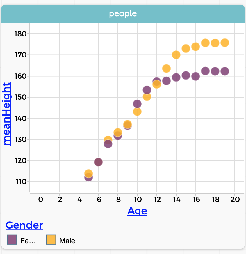
MeanHeight for every age-gender group.Notice what a clean, clear story it tells. Boys’ and girls’ heights are about the same—girls a little taller in the tweens— until about age 13, at which point boys keep growing while the girls slow down. The left-hand graph has all the data, but it doesn’t tell the story as clearly as the right-hand graph.
Data-move reflection: When we moved Gender left, we changed the grouping, and took advantage of the summarizing that was already in place.
5.4 Commentary
This is the conceptual heart of this unit.
Grouping and summarizing are at the center af a huge amount of data analysis. The process is surprsingly deep, too: a group of programmers made this capability in CODAP, and even they didn’t realize how important, how useful it turned out to be. We guarantee you that no student, no matter how brilliant, will fully understand the consequences of that drag-left-in-the-table gesture. One miracle is the way that, when you dragged Gender left to join Age, those two attributes combined to define 30 groups instead of 152, and the formula column adjusted so that it consistently calculated mean height for every group.
At the same time, it’s only sorting the data into groups and taking the mean. It is not rocket science. It’s not even AP Statistics. I think there are really two reasons this is hard.
One is that there’s so much data, we need the computer to help. That means instructing it—by dragging left3— as to what, precisely, we want it to do. That involves computational thinking, having a sense of what kinds of things the computer can do, and the kinds of instructions that work.
But the other reason it’s hard is more insidious: you have to want to group by age and gender, and then take the mean of each group.
So, how to teach it? As with the first part of our height investigation, I did much of this lesson as a demo, with students following along. I went slowly, asking and answering questions, going back and repeating sections as students got their screens to show what they saw on mine. You can let students know that if they forget any of it when they’re doing future work, they can find a step-by-step description in this book. The next assignment will give them a chance to practice these skills.
As a teacher, you will need to be patient but persistent as students gradually come to understand how this works. You can get additional help and perspective in the “data move” chapters on Grouping and Summarizing.
As to developing an intuition about what to group by and why, and how to summarize, my conjecture is that by seeing it a few times, many students will start to get it, even without being able to articulate what’s going on. I also believe, though, that we teachers can gently point out and name the data moves we are making, and remark on their consequences. (“And look! By grouping and summarizing, we now have only 30 points instead of 800. What do you think? Is this graph easier to understand?”)
With that prodding, we nudge them towards metacognition.
Summarizing loses information
Do not think for a moment, however, that summarizing is a panacea. It’s a tool, and we must recognize its limitations and weaknesses. Sure, we went from 800 points down to 30. What happened to those 770 missing points?
The sweep of the means in our graph is lovely, and elegantly shows the overall pattern of growth of girls and boys, but it ignores the individuals. It ignores variability.
Therefore, even if there is no time for a whole lesson on this topic, be sure to ring that chime from time to time. Ask, does this graph mean that every seven-year-old is this height? Or show a graph of only sixteen-year-olds. Notice that some girls are taller than a lot of the boys, and that some boys are really short. Invite students to speculate how they could draw a graph that showed the overall story and, at the same time, showed the variability.
That is, rescue students from the tyranny of the center. As a society we are often held in thrall. We hear that median home prices in Westview are higher than in Dust Gulch, so we assume that evey home is Dust Gulch is a shack and every one in Westview a mansion. We read that test scores (which are always mean test scores) are higher in Blue Sky Unified, so we assume that our children will get a good education only if we move there.